Anime Comic Production · 4 / 5
Anime Comic Production 04
ACADEMY MASTERCLASS — Compendium of Anime Comic Book Production
Volume 4: Fukidashi & Lettering
Issue Reference Prefix: AM-04
Prerequisite: AM-01 — Foundations of Panel Grammar, AM-02 — Page Composition & Layout Architecture, AM-03 — Pacing, Time & Rhythm Across Pages
Preface to Volume 4
Every volume so far has treated lettering as a downstream consequence of layout decisions made earlier — dialogue density as a pacing tool, a caption box as a time-compression device, the careful avoidance of critical content near a double-page spread's spine gutter. This volume turns the lens fully onto lettering itself: the fukidashi (吹き出し, literally "blown-out" — the Japanese term for the speech balloon, used throughout this compendium because TAC's house style draws directly from manga convention here) and its Western cousin, the word balloon, along with the broader craft of sound-effect lettering, caption design, and the placement discipline that keeps text serving the page rather than fighting it.
Lettering is frequently the most underestimated skill in comics production, partly because it looks simple — draw a bubble, put words in it — and partly because, when done well, it is genuinely invisible: a reader who finishes a well-lettered chapter rarely consciously notices the lettering at all, because their eye moved through it without friction. This invisibility is the craft's actual goal, and it is achieved through a surprisingly large number of small, precise decisions: bubble shape vocabulary, tail direction and placement, reading-order discipline within multi-balloon panels, sound-effect integration with the art itself, and the deliberate negotiation between text and composition established in the previous three volumes.
This volume covers: the shape vocabulary of fukidashi and what each shape communicates; tail mechanics and how they encode who is speaking and how; reading-order rules for panels with multiple balloons; the distinct manga and Western conventions for onomatopoeia and sound-effect lettering; caption box design and voice; and the placement discipline that prevents lettering from undermining the composition work of Volumes 1 through 3.
4.1 — The Shape Vocabulary of Fukidashi
A speech balloon's outline shape is not a neutral container — it is, in both manga and Western comics, a coded signal that tells the reader how a line is being delivered before they've read a single word inside it. This shape vocabulary is one of the most universally legible conventions in all of sequential art, recognized by readers even when they cannot articulate the rule explicitly.
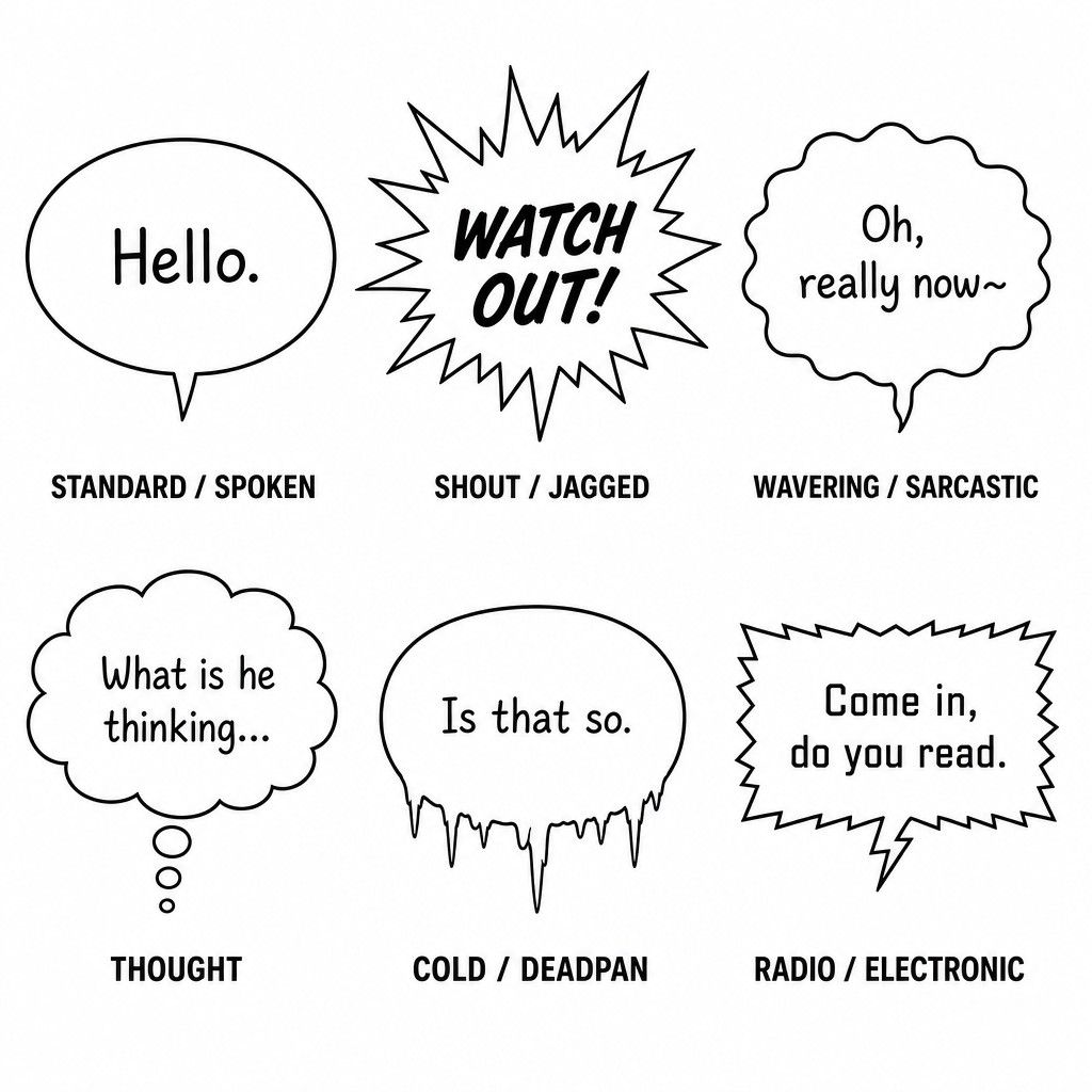
The standard oval/round balloon. A smooth, closed, rounded outline (oval, or a rounded-rectangle in some Western house styles) signals ordinary spoken dialogue at conversational volume. This is the default, "neutral" balloon shape, used for the overwhelming majority of dialogue in any chapter, and its sheer frequency is precisely why deviations from it carry weight — a reader who has seen forty round balloons in a chapter will immediately register the forty-first balloon's different shape as meaningful.
The jagged/spiked balloon (manga: gizagiza fukidashi). A balloon with a sharp, spiked, explosive outline — points radiating outward rather than a smooth curve — signals shouting, sudden exclamation, or aggressive volume. This convention is shared almost identically between manga and Western comics, though manga tends to use sharper, more numerous spikes for a more visually aggressive effect, while American comics (particularly in the Image/McFarlane tradition) often pair the jagged shape with bolder, larger lettering inside it for compounded emphasis.
The wavy/scalloped balloon. An outline made of soft, rolling, wave-like bumps rather than a smooth oval signals a wavering, sing-song, sarcastic, drunk, or otherwise tonally "off" delivery — the visual wobble mirrors a vocal wobble. This shape is used somewhat more frequently and with finer gradation in manga (where it can signal anything from drunkenness to a character speaking in a deliberately mocking sing-song) than in mainstream Western superhero comics, though it appears throughout both traditions for comedic or unsettling dialogue.
The bubble-chain "thought balloon." Historically rendered as a cloud-like scalloped outline connected to its speaker by a trail of small shrinking circles rather than a solid tail, the thought balloon signals unspoken internal monologue. This convention has fallen out of favor in much contemporary mainstream Western comics (modern American houses increasingly prefer rendering interior thought as captions in a character-specific voice, treated in section 4.5 below, rather than a distinct balloon shape) but remains genuinely useful and still common in manga, where the visual distinction between "spoken aloud" and "thought silently" is frequently load-bearing for plot mechanics (a character's true feelings contradicting what they say aloud in an adjacent spoken balloon on the same panel). This compendium recommends TAC retain the classic thought-balloon convention specifically for sequences where the gap between spoken and internal dialogue is doing narrative work — for example, a character maintaining composure in spoken dialogue while a thought balloon reveals contradictory internal doubt — since this is precisely the kind of layered characterization moment where the visual distinction earns its keep.
The icicle/dripping balloon. A balloon with small downward-pointing icicle-like drips along its lower edge, used in manga to signal a cold, flat, deadpan, or menacing delivery — often paired with an expressionless or shadowed face. This shape has no strong equivalent convention in mainstream Western comics and represents one of the genuinely useful "borrowed" tools available to a hybrid house style like TAC's, particularly suited to antagonist dialogue or morally ambiguous characters delivering an unsettling line without raising their voice.
The radio/electronic balloon (squared-off, jagged-edged rectangle or balloon with a zigzag border). Signals dialogue delivered through a speaker, radio, comm-link, or any electronic intermediary rather than spoken directly face-to-face. Both traditions converge on a similar visual solution here — a harder-edged, more geometric or static-jagged outline distinct from organic spoken dialogue — making this one of the most cross-compatible conventions in the entire vocabulary, and a genuinely essential tool for TAC given how much of the Drift Coalition and Vortex Station material involves remote, suit-to-suit, or station-wide comm dialogue.
The off-panel balloon with a long extended tail. Not a shape variant exactly, but a placement variant worth naming here: a balloon whose tail extends unusually far, sometimes crossing most of the panel, to indicate the speaker is off-panel entirely (heard but not seen) or speaking from a significant distance within the same scene. The tail's length and direction become the primary signal of the speaker's location when the speaker's body itself isn't drawn.
[AM-04.F01] — Instructional comic lettering reference sheet showing a clean 2x3 grid of six labeled fukidashi speech balloon examples on white background, each containing simple placeholder lettering text and a small caption beneath naming its type. Balloon 1 "STANDARD / SPOKEN" is a smooth clean oval outline with a small pointed tail. Balloon 2 "SHOUT / JAGGED" has a sharp explosive spiked outline radiating outward with bold lettering inside. Balloon 3 "WAVERING / SARCASTIC" has a soft wavy scalloped bumpy outline. Balloon 4 "THOUGHT" is a cloud-like scalloped outline connected to a small trail of three shrinking circles instead of a solid tail. Balloon 5 "COLD / DEADPAN" has small icicle-like drips hanging from its lower edge. Balloon 6 "RADIO / ELECTRONIC" is a harder geometric rectangular balloon with a jagged zigzag border suggesting static. Clean black and white instructional comic lettering textbook diagram, precise line work, legible small sans-serif captions beneath each balloon.
4.2 — Tail Mechanics: Encoding Who Is Speaking
The balloon's tail (the small pointed extension connecting the balloon body to its speaker) is doing more grammatical work than its modest size suggests, and tail mechanics are governed by a precise set of conventions in both traditions.
Tail direction must point unambiguously to its speaker. This sounds obvious, but in any panel containing more than one character, tail direction is the single most important disambiguating signal the reader has for who is saying what — more important, in practice, than balloon position alone, because balloon position is frequently constrained by available negative space rather than by proximity to the correct speaker. A tail that points toward the wrong character, or toward a position ambiguous between two characters, is one of the most common and most damaging lettering errors in amateur work, because it actively breaks the reader's comprehension of the scene rather than merely looking unpolished.
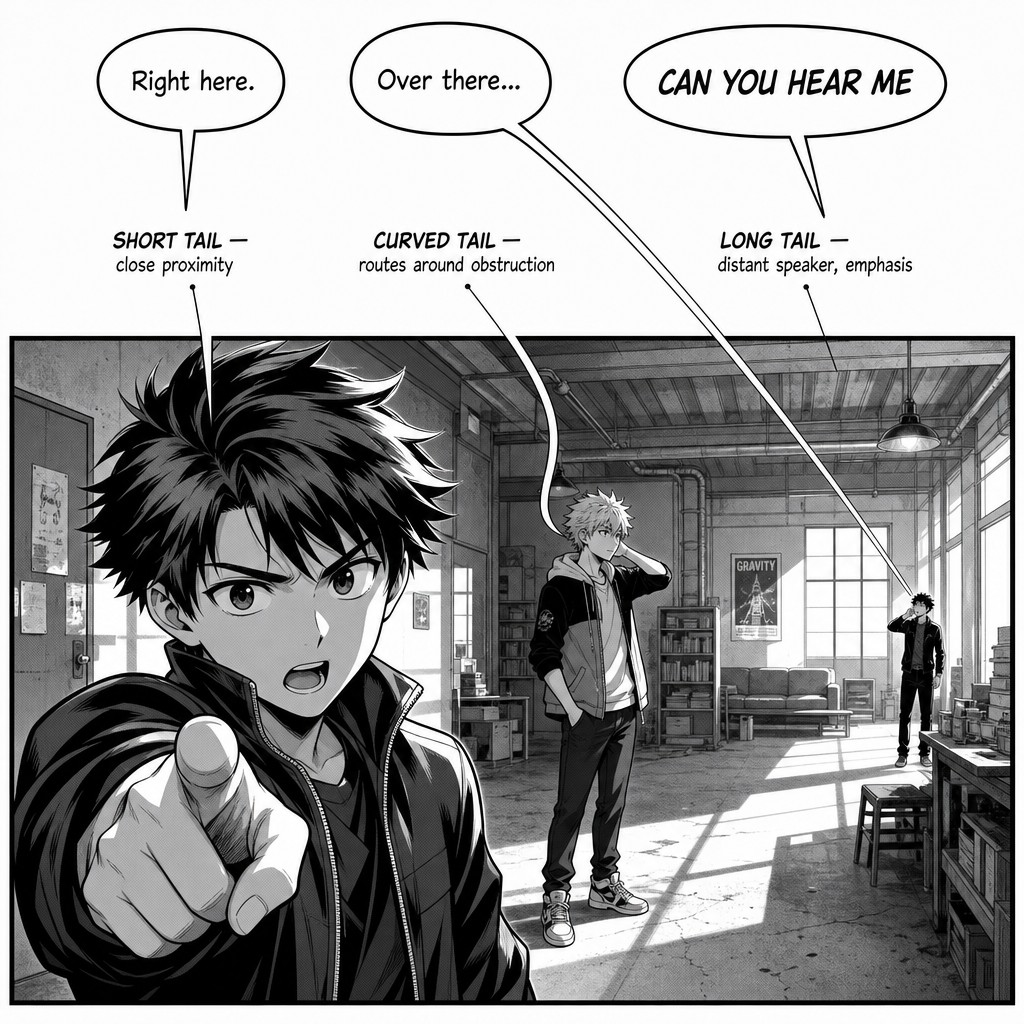
Tail length and curve communicate distance and emphasis. A short, direct tail signals a close, immediate, conversational delivery. A long, gently curving tail can route around intervening art elements (a foreground object, another character's head) while still reading clearly as connected to its speaker — and the act of curving the tail around an obstacle, rather than letting it overlap awkwardly, is a small but telling mark of lettering craftsmanship. An exceptionally long, straight tail (sometimes called a "spear" tail in production slang) is occasionally used deliberately for comedic emphasis or to signal a shouted line crossing significant distance within a panel.
Multiple tails from one balloon. Occasionally a single balloon needs to indicate that two characters are speaking the same line simultaneously (a shared exclamation, a chorus effect) — handled by giving one balloon two tails pointing to two different speakers. This is a relatively rare device in both traditions, reserved for moments of genuine simultaneity rather than used as a space-saving shortcut, since overuse undermines the convention's clarity.
No tail at all. A balloon with no tail signals either a general ambient sound/dialogue not attributable to a specific visible speaker (background chatter, a crowd, an announcement filling a space) or, in some house styles, a stylistic choice for a god's-eye narrator voice distinct from any character. This compendium recommends reserving the tailless balloon specifically for the ambient/crowd use case in TAC, to avoid diluting its meaning.
[AM-04.F02] — Instructional comic lettering diagram demonstrating tail mechanics, shown as a single panel containing three anime-style characters positioned at different depths within a room. Three speech balloons are drawn above the panel, each with a clearly distinct tail: one balloon has a short, direct, straight tail pointing to the nearest foreground character; one balloon has a longer gently curving tail that bends around the silhouette of an intervening character's head to reach a character standing further back; one balloon has an unusually long straight tail crossing most of the panel width to reach a character standing far in the background, demonstrating distance and emphasis. Small instructional annotation arrows and labels point to each tail describing its function: "SHORT TAIL — close proximity," "CURVED TAIL — routes around obstruction," "LONG TAIL — distant speaker, emphasis." Clean black and white manga-influenced instructional diagram style.
4.3 — Reading Order Within Multi-Balloon Panels
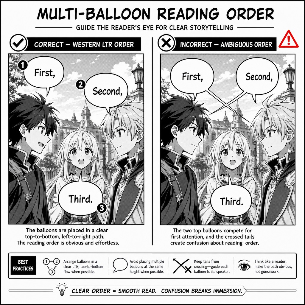
When a single panel contains two or more speech balloons, the order in which the reader's eye encounters them must be unambiguous, and this is governed by the same reading-direction logic established in Volume 1 — but applied at a much finer grain, panel by panel rather than page by page.
The governing rule. In a Western left-to-right format, balloons within a panel should be arranged so the reading order proceeds top-to-bottom and left-to-right, matching the macro page reading order established in Volume 1. In manga's right-to-left format, the equivalent rule reverses: balloons proceed top-to-bottom and right-to-left within the panel. Critically, this means balloon placement inside a panel is not primarily about composition or available negative space — it is primarily about reading-order correctness, and any composition or negative-space consideration must yield to it. A beautifully composed panel with balloons placed in an order that contradicts the established reading direction is a functional failure regardless of how attractive it looks, because it will cause readers to read dialogue in the wrong sequence.
Vertical stacking for rapid exchange. When two characters are trading short, fast lines in immediate succession within a single panel, balloons are frequently stacked vertically in reading order along roughly the same horizontal position, each with a short tail to its respective speaker, allowing the reader to move through a rapid exchange without their eye needing to travel far across the panel. This technique directly supports the pacing tools established in Volume 3 — a vertically stacked rapid exchange reads faster than the same dialogue spread into separate panels would, making it a useful compression technique for a tense, fast-talking scene that doesn't warrant the page-space cost of additional panels.
Numbering as a fallback, not a first resort. Some Western house styles, when balloon placement genuinely cannot avoid an order ambiguous to the natural reading path (a complex panel with several characters at varying depths), resort to small numeral marks near each balloon indicating explicit reading order. This compendium treats this as a last-resort fallback rather than standard practice — competent panel composition and tail placement should make explicit numbering unnecessary in the overwhelming majority of cases, and frequent reliance on it is usually a sign that the underlying panel composition (established in Volumes 1 and 2) needs rethinking rather than that the lettering needs a numbering patch.
[AM-04.F03] — Instructional comic page diagram demonstrating multi-balloon reading order within a single panel, shown as two side-by-side panel examples. LEFT EXAMPLE labeled "CORRECT — WESTERN LTR ORDER" shows one panel with three anime-style characters and three speech balloons arranged so the reading order flows clearly top-to-bottom and left-to-right, with small numbered circles 1, 2, 3 marking the correct sequence matching the balloon positions. RIGHT EXAMPLE labeled "INCORRECT — AMBIGUOUS ORDER" shows the same panel and same three characters but with the balloons repositioned so their natural reading order is genuinely ambiguous — two balloons positioned at roughly the same height with crossing tails, creating visual confusion about which is read first, marked with a small red warning symbol. Clean black and white instructional comic lettering diagram, small sans-serif captions beneath each example.
4.4 — Onomatopoeia and Sound Effect Lettering
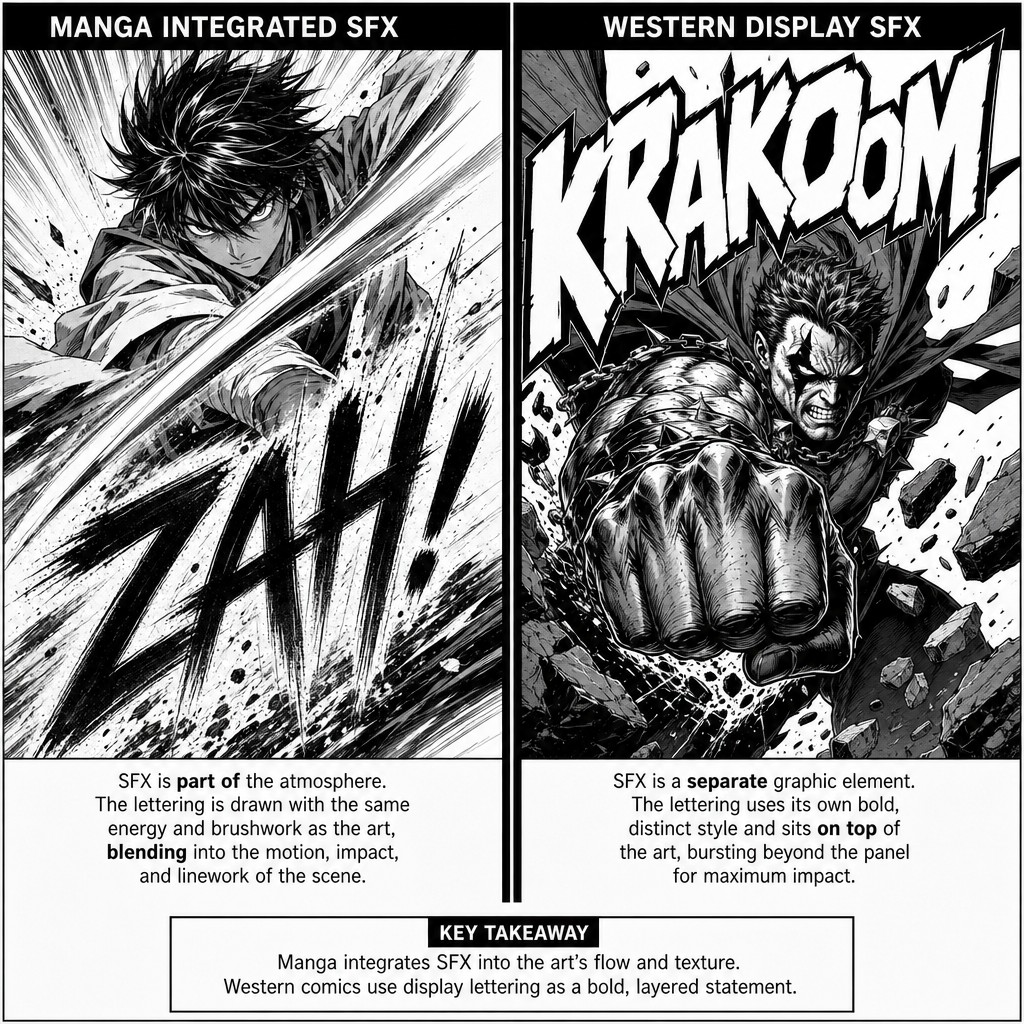
Sound effects (often abbreviated "SFX" in Western production terminology, and a major, highly developed art form in their own right within manga, where they are called giongo for sound-imitating words and gitaigo for state/feeling-imitating words) represent one of the sharpest stylistic divergences between the manga and American traditions, and TAC's hybrid approach needs a clear policy for reconciling them.
The manga convention: SFX as integrated linework. In manga, sound effects are very frequently hand-lettered directly into the artwork itself, often by the original artist rather than a separate letterer, using brushwork and line quality that matches the surrounding art's linework — a sound effect for a sword strike might be rendered with the same dynamic ink-brush energy as the speed lines around it, becoming functionally part of the illustration rather than a separate text layer applied on top of it. Manga SFX also draws on a vastly larger vocabulary than English-language sound effects, including the gitaigo category mentioned above — words that don't represent literal sound at all but rather a felt sensation or atmosphere (a tense silence, a piercing stare, a sudden chill), a category with no real equivalent in Western sound-effect convention, where lettering is reserved almost exclusively for literal audible sound.
The Western convention: SFX as bold, separate display lettering. American comics, including McFarlane's Spawn-era work specifically, tend to treat sound effects as large, separately-rendered display lettering — often in a distinct, heavily stylized typeface or hand-lettered display script, frequently overlapping panel borders or bursting across multiple panels, but generally remaining visually distinct from the linework of the illustration itself rather than being woven into it. This makes Western SFX somewhat easier to localize/translate (since it isn't integrated into the linework, swapping the text doesn't require redrawing art) but arguably less visually unified with the art around it compared to manga's integrated approach.
A practical hybrid policy for TAC. Given SAGE's production pipeline (AI-assisted image generation followed by a digital lettering pass) and the project's bilingual production context, this compendium recommends a hybrid approach: render high-impact, action-critical SFX (impacts, explosions, Anima Principle activations) using the manga-influenced integrated approach — brushed, dynamic lettering that reads as part of the artwork — reserved for moments where visual unity and maximum impact matter most, while using the Western separate-display-lettering approach for more incidental or frequent environmental sound (footsteps, ambient mechanical hums, background chatter) where localization flexibility and faster production turnaround matter more than maximal visual integration. This mirrors the same "spend your most expensive technique on your highest-value beats" discipline established for splash pages and double-page spreads in earlier volumes.
Gitaigo as an opportunity, not just an import. TAC's Anima Principles system — internal, often non-physical states given narrative weight — is a strong structural match for the gitaigo convention's core idea: rendering a felt internal or atmospheric state as a lettered visual element even though nothing is technically making an audible sound. This compendium suggests TAC's comic adaptation could productively develop its own consistent gitaigo-style lettering vocabulary specifically tied to Anima Principle activations, giving each Principle (or at least the most narratively central ones) a recognizable felt-sensation lettering treatment distinct from ordinary sound effects — a worldbuilding opportunity unique to translating this particular IP into comic form.
[AM-04.F04] — Instructional comic page comparison diagram showing two contrasting sound effect lettering approaches side by side within similar dynamic action panels. LEFT PANEL labeled "MANGA INTEGRATED SFX" shows an anime character delivering a sword strike, with a large dynamic Japanese-style sound effect lettering rendered directly into the artwork using the same energetic ink-brush linework as the surrounding speed lines and impact marks, the SFX text visually inseparable from the illustration itself. RIGHT PANEL labeled "WESTERN DISPLAY SFX" shows a similar dynamic impact moment, but the sound effect is rendered as large bold separate display typography in a distinct stylized font, clearly layered on top of the artwork rather than blended into the linework, bursting dramatically across the panel border in a McFarlane-influenced style. Clean instructional diagram captions beneath each panel, dynamic high-energy comic art throughout.
4.5 — Caption Box Design and Narrative Voice
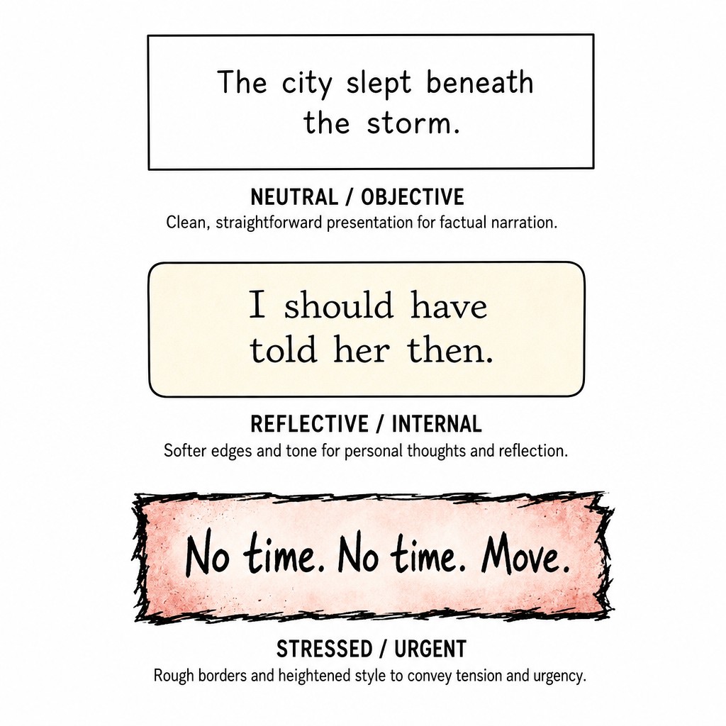
Captions — rectangular text boxes distinct from speech balloons, used for narration, internal monologue (in Western houses that favor this over thought balloons), or the time/location stamps discussed in Volume 3 — carry their own design discipline, separate from fukidashi craft, because a caption represents a different narrative register: it is text from outside the immediate dramatized moment, even when (as with internal monologue captions) it originates from a character within the scene.
Visual differentiation by narrative voice. When a story uses captions from more than one narrative source — for instance, alternating first-person internal monologue captions from different protagonists across TAC's ensemble cast — each distinct narrative voice should receive a consistent, distinguishable visual treatment: a different caption box color or border style, a different background tone, sometimes a different typeface weight. This allows a reader flipping between, say, Dr. Sarah Chen's internal captions and Kai's internal captions across a crosscut sequence to instantly identify whose perspective they're reading without needing to consciously parse the prose voice — extremely valuable for a six-protagonist structure where rapid perspective-switching is structurally common.
Caption shape as tonal signal, paralleling balloon shape vocabulary. Just as balloon shape encodes delivery (section 4.1), caption box border treatment can encode register: a clean, sharp-cornered rectangle reads as neutral, objective narration; a softer rounded-corner box can signal a gentler, more reflective internal voice; a rougher, hand-inked or distressed border can signal a stressed, urgent, or unreliable narrating perspective. This compendium recommends TAC use this caption-shape vocabulary deliberately rather than defaulting to one uniform caption style throughout, particularly for sequences where a character's internal narration is meant to read as compromised, panicked, or otherwise tonally distinct from their ordinary baseline voice.
Caption placement and the composition discipline established in Volume 2. Captions, like balloons, must be placed without violating the visual-weight and negative-space principles established earlier in this compendium — a caption box placed directly over a panel's most important visual content (a character's face, a critical action beat) undermines the very composition it's meant to support. The conventional safe placement is the upper-left or upper-right corner of a panel (matching the page's natural reading-entry corner, per the reading-direction conventions established in Volume 1), though this is a strong default rather than an absolute rule — a caption can be deliberately placed elsewhere when that placement itself communicates something (a caption positioned low and small in a vast, mostly-empty panel can reinforce the isolation effect discussed in Volume 2's treatment of negative space).
[AM-04.F05] — Instructional comic lettering reference sheet showing three distinct caption box styles arranged in a vertical column, each containing simple placeholder narration text and labeled beneath. Caption 1 labeled "NEUTRAL / OBJECTIVE" is a clean sharp-cornered rectangular box with simple black border and white background, standard narration typeface. Caption 2 labeled "REFLECTIVE / INTERNAL" is a softer rounded-corner box with a slightly warm off-white background tone, gentler serif-influenced lettering suggesting a more personal internal voice. Caption 3 labeled "STRESS / URGENT" has a rougher, slightly distressed hand-inked border with jagged uneven edges and a faint red-tinted background wash, suggesting a panicked or unreliable internal narrating perspective. Clean instructional comic lettering textbook diagram, small sans-serif captions beneath each example explaining its tonal function.
4.6 — Lettering as a Compositional Citizen, Not a Final Overlay
The most advanced principle in this volume, and the one most often violated under production pressure, is this: lettering must be considered during the page composition pass described in Volume 2's whole-page composition method, not added afterward as a final overlay on finished art. Treating lettering as an afterthought — composing and rendering a beautiful page first, then trying to find somewhere to fit the dialogue — routinely produces exactly the kind of composition-undermining placement problems described throughout this volume: balloons covering important detail, tails crossing awkwardly through figures they shouldn't, reading order fighting the panel's natural eye-path.
The practical production discipline. When a page is scripted, the dialogue and caption content (along with a rough sense of how much text each line will require, since text length directly affects balloon size and therefore composition) should be known before final art begins, allowing the artist composing the page to leave deliberate negative space for balloons in the same whole-page weight-blocking pass described in Volume 2 — treating balloon placement as one more shape to be composed into the page's overall value and weight distribution, alongside panel borders and figure blocking, rather than as text dropped onto a completed image afterward.
Why this matters disproportionately for an AI-assisted pipeline. GPT Image 2's strong text-rendering capability (confirmed extensively in this compendium's companion image generation) makes it genuinely possible to generate finished art with lettering already integrated in a single inference pass — but this capability is only as good as the composition discipline behind the prompt that requests it. A prompt that specifies dialogue content without also specifying where on the page that dialogue needs room to exist, relative to the action being depicted, will produce technically correct lettering placed in compositionally poor locations just as readily as a human letterer working from finished art would. The lettering principles in this volume apply with equal force whether the final art is hand-drawn, AI-generated, or some hybrid of both — the underlying reading-order and composition discipline is medium-independent.
4.7 — Closing Summary of Volume 4
This volume turned the compendium's focus to fukidashi and lettering as a discipline in its own right, building on every prior volume's compositional groundwork rather than treating text as separate from it. It established the shape vocabulary of speech balloons (standard, jagged/shout, wavy/wavering, thought, icicle/deadpan, radio/electronic) and what each communicates before a word is read; the mechanics of tail direction, length, and curve as the primary disambiguating signal for who is speaking; the strict reading-order discipline governing multi-balloon panels, which must follow the page's established reading direction rather than yield to composition convenience; the sharp divergence between manga's integrated-linework sound-effect tradition (including the gitaigo category of felt-sensation lettering with no Western equivalent) and the West's bold separate-display SFX convention, with a recommended hybrid policy and a specific suggestion to develop TAC-original gitaigo-style lettering for Anima Principle activations; caption box design as a tool for distinguishing narrative voice across TAC's ensemble cast; and the overarching discipline of treating lettering as a compositional citizen considered during the page-blocking pass, not a final overlay — a discipline that applies equally to traditionally drawn pages and to AI-assisted generation through GPT Image 2.
Volume 5 turns to the volume this compendium has been building toward across its first four installments: action choreography and the splash/hero page — how dynamic panel shapes, kinetic panel borders, and the deliberate, disciplined use of full-page and double-page spectacle moments bring together everything established in panel grammar, page composition, pacing, and now lettering into the genre's most demanding and most rewarding compositional category.
End of AM-04. Continue to AM-05: Action Choreography & the Splash/Hero Page.
❦ FIN ❦