Anime Comic Production · 2 / 5
Anime Comic Production 02

ACADEMY MASTERCLASS — Compendium of Anime Comic Book Production
Volume 2: Page Composition & Layout Architecture
Issue Reference Prefix: AM-02
Prerequisite: AM-01 — Foundations of Panel Grammar
Preface to Volume 2
Volume 1 established the atomic unit of sequential art: the panel, its border, the gutter that separates it from its neighbors, and the grammar of reading direction. This volume moves one level up the hierarchy. The page — not the panel — is the true compositional unit a working artist designs against, and treating a page as "a container you fill with panels one at a time" rather than "a single image you are composing, which happens to be subdivided into panels" is the single most common mistake separating amateur layout work from professional page design.
This distinction matters more for anime-influenced comics than almost any other format, because both of TAC's stylistic ancestors — manga and McFarlane-era Image Comics — are traditions built explicitly around page-as-unit thinking. A manga-ka does not draw panel 1, then panel 2, then panel 3 in isolation; they block the entire page's negative space, weight distribution, and eye-path first, then populate it. McFarlane's most famous Spawn pages are, structurally, single dramatic illustrations that have been subdivided after the fact into a small number of panels — not a grid that got filled in.
This volume covers: the tier system and how panels combine into rows; how panel size and placement create reading-path "weight"; the architecture of guiding the eye across a full page using composition, not just panel order; negative space as an active design element rather than empty leftover; and the double-page spread as a wholly separate compositional category governed by its own rules.
2.1 — The Tier System: How Panels Become a Page
The most common organizing structure underneath nearly every comic page — manga or American, gridded or grid-breaking — is the tier: a horizontal band across the page containing one or more panels, stacked vertically with other tiers to build the full page.
Even pages that look wildly irregular at first glance are, in the vast majority of professional work, still built on an underlying tier logic the artist is choosing to disguise or interrupt rather than abandon entirely. A page might have three tiers: a tall establishing tier at the top, a busy three-panel action tier in the middle, and a wide single-panel "landing" tier at the bottom. Each tier can contain anywhere from one panel (a tier that is, itself, a single full-width panel) to five or six (a tier built from very narrow panels, often used for rapid-fire reaction shots or a fast-cut action sequence).
Why tiers persist even in "broken grid" pages: the human eye reads pages the way it reads text — left-to-right or right-to-left in rows, then drops down to the next row. Even McFarlane's most chaotic-looking Spawn pages, where panel borders are irregular and overlapping, are still constructed so the reader's eye intuitively understands "this cluster of shapes is the top portion of the page, read it before dropping down to this cluster below it." When an artist genuinely abandons tier logic altogether — true freeform, non-tiered composition — the result risks becoming illegible, because the reader has no learned convention to fall back on for "what do I look at next." This is rare, reserved for deliberately disorienting sequences (dream logic, psychic intrusion, a character's complete loss of spatial coherence), and almost never used for ordinary narrative pages.
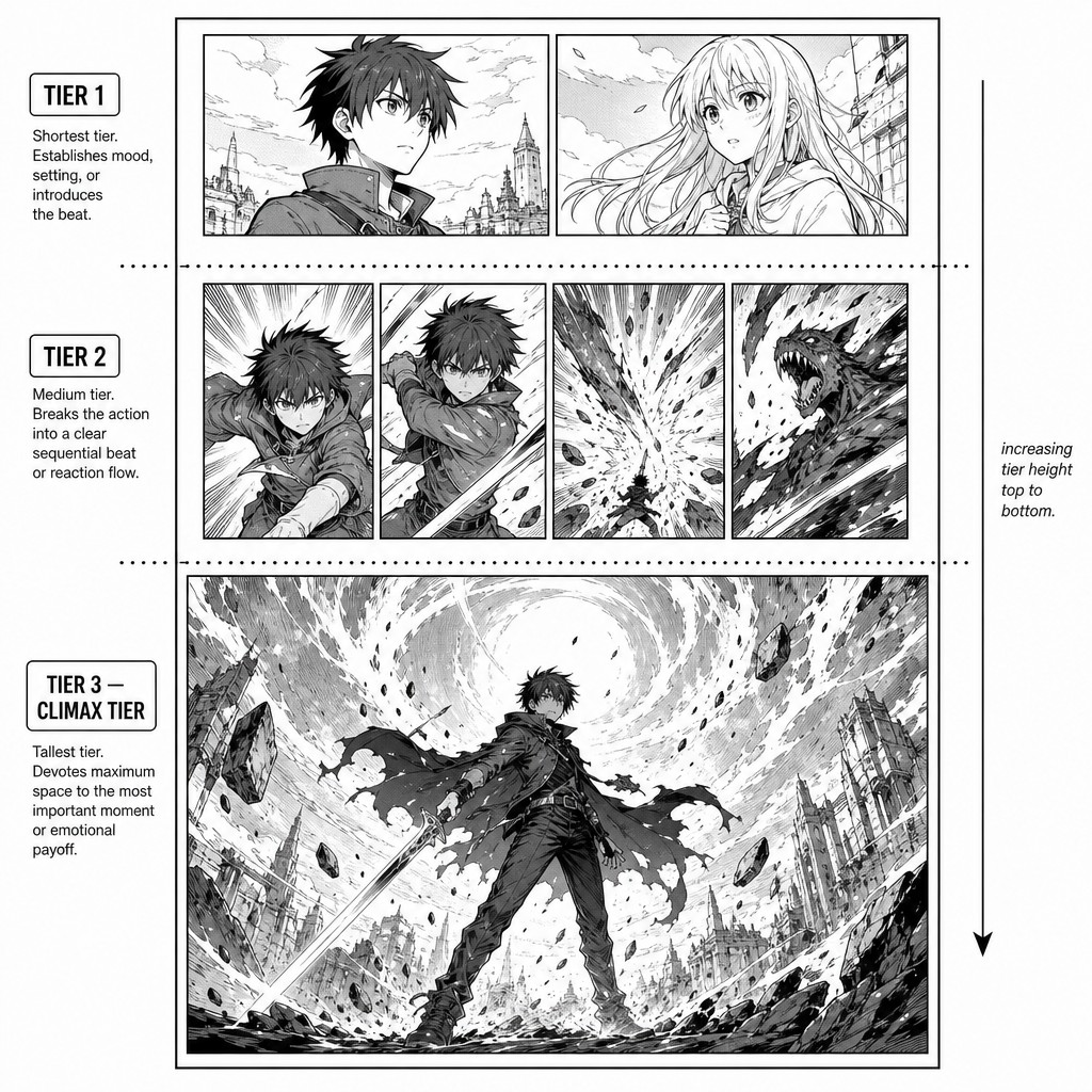
Tier height variance is a pacing tool, just like panel density was in Volume 1. A page built from three equal-height tiers reads with a steady, metronomic rhythm — useful for procedural sequences, parallel-action crosscutting, or calm expository dialogue. A page that opens with a short, compressed tier and ends with one enormous tier (or a single full-width "hero" tier) builds toward that final tier as the page's climax — the reader's eye, having been trained by the smaller tiers above, registers the sudden increase in scale as "this is the moment the page has been building to."
[AM-02.F01] — Instructional layout diagram showing a single comic page broken into three labeled horizontal tiers: a short two-panel tier at top labeled "TIER 1," a busy four-panel tier in the middle labeled "TIER 2," and one enormous single full-width panel at the bottom labeled "TIER 3 — CLIMAX TIER," with a dotted horizontal line marking the boundary between each tier and a small annotation noting increasing tier height from top to bottom, clean black and white manga-style instructional diagram.
2.2 — Panel Weight and the Architecture of Eye Movement
A page is, before it is anything else, a single flat image the reader's eye encounters all at once for a fraction of a second before beginning to read it sequentially. In that first fraction of a second, the eye is not reading panel order — it is responding to visual weight: which shapes on the page are largest, darkest, most detailed, or most centrally positioned. A skilled page designer uses this pre-sequential glance deliberately, making sure the panel that should dominate the reader's first impression of the page is, in fact, the one that does.
Visual weight is governed by several compounding factors, and a page designer is, in effect, balancing all of them simultaneously:
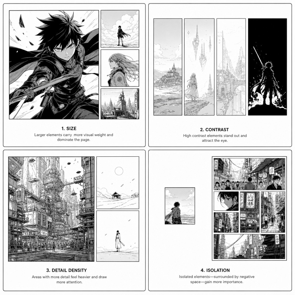
Size. The most obvious factor — a larger panel draws the eye first, almost regardless of other factors. This is why splash panels (addressed fully in Volume 5) work even when placed in unconventional positions on a page; their sheer size overrides positional convention.
Value contrast (light vs. dark). A predominantly white/light page with one heavily inked, high-contrast black panel will pull the eye to that panel first, because the eye is drawn to the area of greatest contrast against its surroundings. McFarlane's Spawn pages use this constantly — entire tiers of comparatively quiet, lighter panels building toward one panel saturated in heavy black spotting (areas of solid black ink) that becomes the unmistakable visual anchor of the page.
Detail density. A panel rendered with significantly more linework, texture, or rendering detail than its neighbors reads as more "important" even at equal size, because the eye assumes greater detail signals greater narrative significance — a convention TAC can use deliberately: a Crater City establishing panel rendered with dense architectural detail against comparatively sparse character panels around it signals "absorb this world-detail," while a sparse, high-detail-on-character-only panel signals "focus on this person, not their surroundings."
Position. As established in Volume 1's reading-path discussion, position itself carries weight independent of size or contrast. In a Western left-to-right page, the top-left position is "first encountered" and the bottom-right is "last/concluding." In manga's right-to-left format, top-right is first and bottom-left is concluding. A panel placed at the page's natural terminus position inherits some dramatic weight purely from being where the reader's eye is, structurally, going to land last — which is part of why "the last panel on the page" is such a common location for a cliffhanger beat, a punchline, or a reveal, in both traditions.
Isolation. A panel surrounded by unusually generous white space (relative to its neighbors) reads as set apart, privileged, almost as if the page itself is giving that panel room to breathe — a technique borrowed directly from manga's decompression conventions discussed in Volume 1, and one of the most reliable ways to make a single quiet character beat land with weight on an otherwise busy page.
These five factors do not operate independently — a professional page designer is constantly trading them off against each other. A small panel can still dominate a page if it has overwhelming contrast and isolation around it; a large panel can be visually subordinate to a smaller one if it is rendered flat and grey while the smaller panel is rendered in stark black-and-white contrast.
[AM-02.F02] — Instructional comic page diagram demonstrating visual weight factors, divided into four small labeled example panels arranged in a 2x2 grid on one page, each isolating a single weight factor: example 1 labeled "SIZE" shows one large panel dominating three small panels around it; example 2 labeled "CONTRAST" shows a page of light grey-toned panels with one heavily black-inked panel pulling the eye; example 3 labeled "DETAIL DENSITY" shows a richly rendered architectural panel beside two sparse minimal-line panels; example 4 labeled "ISOLATION" shows one small panel surrounded by unusually large areas of white negative space compared to a busy panel cluster beside it, clean instructional black and white diagram style with small sans-serif captions under each example.
2.3 — Negative Space as an Active Compositional Element
Beginning artists, under production pressure, tend to treat the white space of the page (the area outside any panel border, including the gutters and any margin around the page edge) as leftover — whatever's left once the panels are placed. Master page designers, in both the manga and American traditions, treat negative space as a drawn element in its own right, deliberately shaped and weighted exactly as carefully as the panels themselves.
This is most visible in three specific techniques, all of which recur constantly across both traditions:
The "breathing" page. A page that deliberately uses far less than its available panel-space — for instance, two modest panels positioned in the upper third of an otherwise blank page — uses the surrounding white as a form of visual silence. This technique appears throughout decompressed manga (a quiet character moment given an entire mostly-empty page) and, in American comics, in the quieter, more literary corners of the Image Comics catalogue and creator-owned books that followed McFarlane's generation, where restraint became its own form of stylistic signature once the initial "more is more" maximalism of early Image had run its course.
Negative space as implied motion or force. When a figure or effect (an explosion, a burst of energy, a falling object) is drawn bursting toward the edge of its panel and the white gutter beyond is left conspicuously empty in the direction of that motion, the reader's eye reads the empty space as "where the energy is going" — an extension of the action into the unrendered page. This is an extremely common device in both shonen battle manga (energy blasts that seem to continue past the panel edge) and McFarlane-style hero pages (a leaping figure whose motion lines trail off into bare gutter, implying continued momentum the art itself doesn't need to draw).
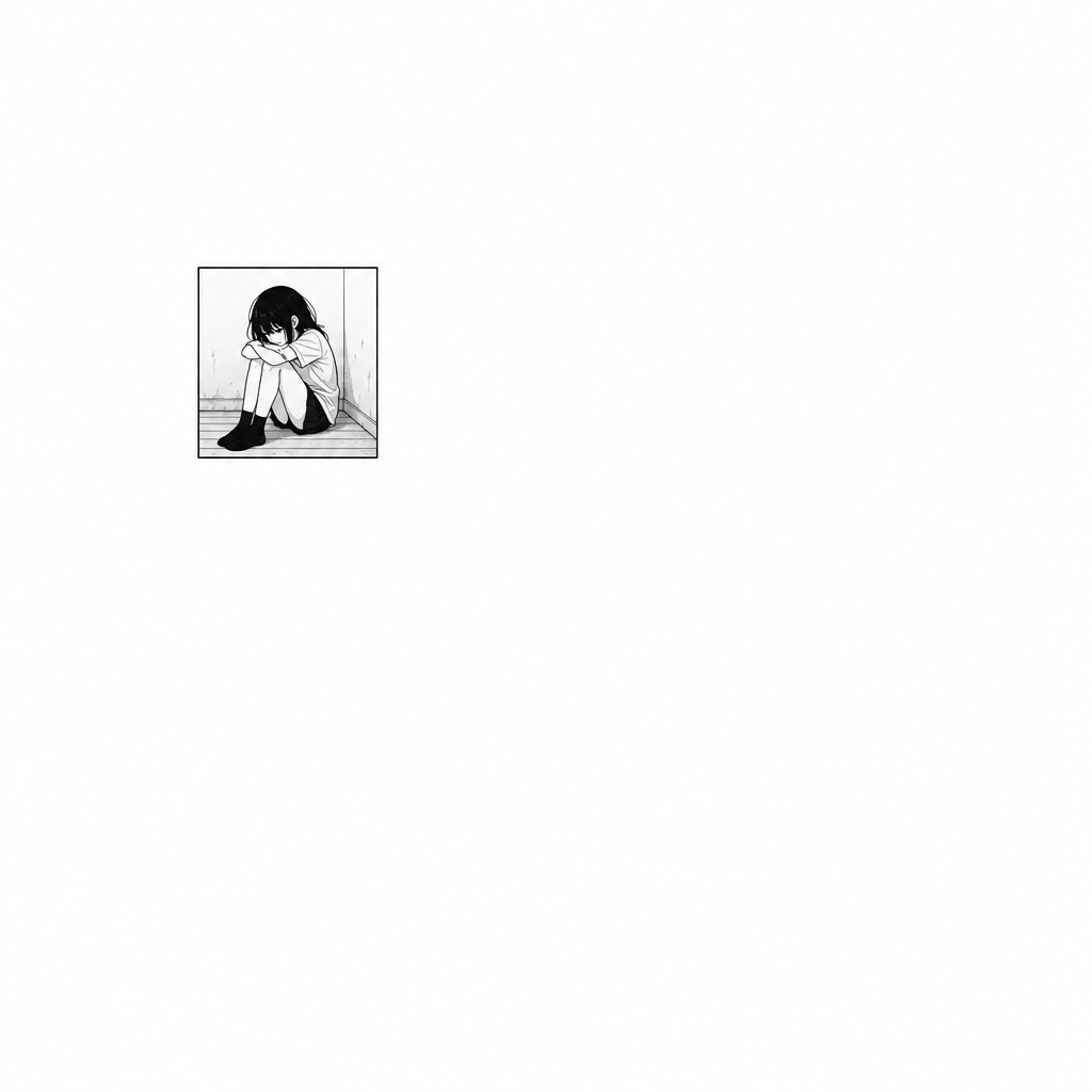
Negative space as isolation and vulnerability. A small, tightly bordered panel surrounded by a disproportionate amount of plain white page, especially when placed off-center, reads as the character (or object) inside it being exposed, small, or alone — visually enacting loneliness or vulnerability through pure spatial arrangement, independent of anything happening inside the panel's own art. This is a technique worth flagging specifically for TAC's quieter emotional beats — moments of doubt for Dr. Sarah Chen, or isolation beats for any of the six protagonists separated from their found-family unit — where the page itself, not just the drawn expression, can carry the emotional weight.
[AM-02.F03] — Instructional comic page example demonstrating negative space as an active compositional element: a single sparse page containing only one small square panel positioned slightly off-center in the upper-left area, showing a single anime-style character sitting alone with a withdrawn, isolated expression, the panel surrounded by a vast disproportionate field of plain white page space, no other panels present, clean minimalist black and white manga-style line art, deliberately spacious and quiet composition emphasizing solitude.
2.4 — Layout Patterns: Naming the Recurring Structures
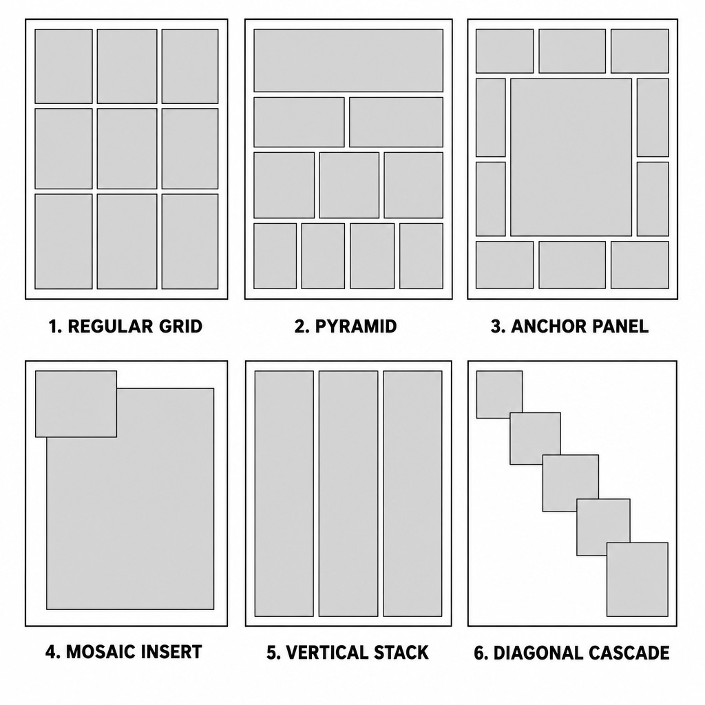
Across decades of manga and American comics production, a relatively small number of recurring page architectures account for the overwhelming majority of professionally published pages. Knowing these by name allows a creative team to communicate layout intent quickly during scripting and thumbnailing, rather than re-deriving page structure from scratch every time. The following are the patterns most relevant to TAC's hybrid house style.
The Regular Grid. Uniform tiers, uniform panel widths within each tier. The default for procedural, dialogue-heavy, or worldbuilding-dense sequences — anything where steady, predictable pacing serves the scene better than visual flourish. This is the correct default for the majority of ordinary TAC scenes; reserve deviation for moments that have earned it.
The Pyramid (or Inverted Pyramid). A page that narrows or widens progressively, tier by tier — for example, a wide single panel at top, narrowing to a tighter three-panel tier, narrowing further to a five-panel tier of rapid small beats at the bottom (a "funnel" effect that accelerates pacing as the eye descends), or the reverse (starting tight and compressed, opening up into one large panel at the bottom for a release of tension). The inverted pyramid — compressed to expansive — is one of the most reliable structures for building toward a page-ending splash-adjacent beat without using a full splash page.
The Anchor Panel Layout. One large panel (not necessarily a full splash) is placed somewhere on the page — frequently centered or in a corner — and several smaller panels are arranged around it in the remaining negative space. This is McFarlane's signature structural device: the "anchor" is usually the page's hero shot, dramatic reveal, or central action beat, and the smaller surrounding panels often function almost like a film's surrounding coverage — reaction shots, secondary action, or connective beats orbiting the main image.
The Mosaic / Insert Panel Layout. A small panel (or several) is placed directly on top of a larger panel, overlapping its border rather than sitting in a separate tier. Common for showing a close-up detail (a clenched fist, an object of significance, a facial reaction) simultaneously with the wider action it's embedded within, without requiring the reader to mentally reassemble two separate sequential panels into one moment. Used heavily in both modern decompressed manga and contemporary American comics; comparatively rare in Silver Age work, where panel borders were treated as more strictly inviolable.
The Vertical Stack (Manga Strip Layout). A tall, narrow column of three or more stacked panels running the full height of the page, frequently used in manga for a single character's rapid internal reaction sequence or a fast vertical fall/descent — the panel shape itself reinforcing the vertical motion of the content. Less common in American comics, where horizontal tiering is more structurally dominant, but a useful tool to borrow deliberately for TAC sequences involving falling, diving (especially Tidalcross underwater sequences), or vertical architecture (Crater City's layered city structure).
The Diagonal Cascade. Panels are arranged so their borders step diagonally across the page rather than sitting in strict horizontal tiers — each panel offset slightly up or down from its neighbor. This produces a strong directional pull across the page and is closely associated with high-kinetic shonen battle sequences, where the diagonal arrangement itself reinforces the sense of characters moving rapidly across the scene.
[AM-02.F04] — Instructional reference sheet showing six small simplified comic page thumbnails arranged in a 2x3 grid, each demonstrating one named layout pattern with a label beneath: "REGULAR GRID" showing uniform tiers, "PYRAMID" showing tiers narrowing from wide to tight top to bottom, "ANCHOR PANEL" showing one large central panel surrounded by smaller panels in the remaining space, "MOSAIC INSERT" showing a small panel overlapping the border of a larger panel beneath it, "VERTICAL STACK" showing three tall narrow panels running the full height of the page, and "DIAGONAL CASCADE" showing panels stepping diagonally across the page, each thumbnail rendered as simplified grey rectangle blocks on white background with clean black borders, instructional textbook diagram style, small sans-serif captions.
2.5 — Composing Across Tiers: The Page as a Single Drawing
The most advanced and most frequently neglected skill in page composition is treating panel borders as internal subdivisions of one continuous image, rather than treating each panel as an independent illustration that happens to be placed near other independent illustrations. This is the technique underlying nearly every truly memorable page from both traditions, and it deserves dedicated explanation because it is genuinely counterintuitive to artists trained panel-by-panel.
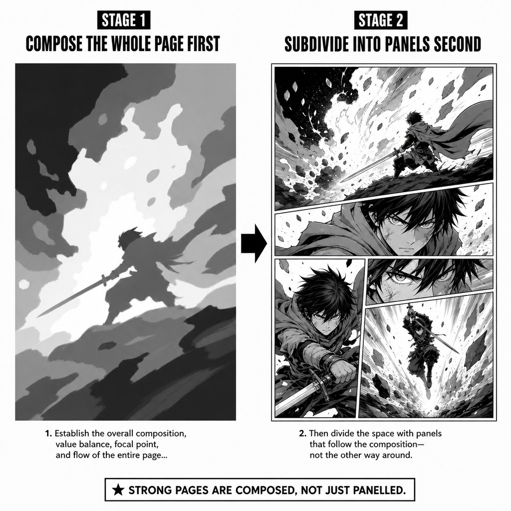
The technique in practice: an artist blocks the entire page's composition — character positions, camera angles, the overall shape language of the page — as if drawing one large image, and only afterward decides where the panel borders will subdivide that image. A figure's outstretched arm in panel 2 might be composed so that its angle visually "points toward" or "continues into" the action in panel 3, even though the two panels are technically separate moments in time. A recurring color or tonal value placed in roughly the same position across several panels in a tier creates a visual rhyme that ties the tier together as a single read, even as the content of each panel changes.
This is the actual mechanism behind why a McFarlane Spawn page or a great manga splash-adjacent page feels "composed" rather than "assembled" — the negative space, the panel borders, and the figures within them are not independent decisions, they're the output of one underlying compositional pass across the whole page.
A practical production method for TAC: when thumbnailing a page, block the page's overall silhouette and weight distribution first — a rough greyscale value sketch showing where the page is dark, where it's light, where the eye should land first and last — before drawing a single panel border. Only once that whole-page composition feels balanced should panel borders be added to subdivide it into readable sequential units. This inverts the instinctive "panel 1, then panel 2, then panel 3" production order, but it is the method that consistently produces pages that read as unified compositions rather than a strip of unrelated images stacked vertically.
[AM-02.F05] — Instructional two-stage diagram demonstrating whole-page composition method. STAGE 1 (left) labeled "COMPOSE THE WHOLE PAGE FIRST": a rough greyscale value-block sketch of an entire comic page with no panel borders at all, showing only large soft-edged shapes indicating where the page will be dark versus light and where the dominant visual weight sits, like an abstract thumbnail value study. STAGE 2 (right) labeled "SUBDIVIDE INTO PANELS SECOND": the same composition now overlaid with clean panel borders that subdivide the same underlying value composition into five sequential panels, with a dynamic anime action sequence rendered inside, demonstrating that the panel borders follow the pre-existing composition rather than dictating it, clean instructional diagram style, side by side comparison with an arrow between the two stages.
2.6 — The Double-Page Spread: A Separate Compositional Category
Everything discussed so far in this volume governs a single page. The double-page spread — two facing pages designed and read as one continuous image — is not simply "a wide single page." It is governed by its own distinct set of rules, and treating it as an oversized regular page is one of the most common production mistakes in comics layout.
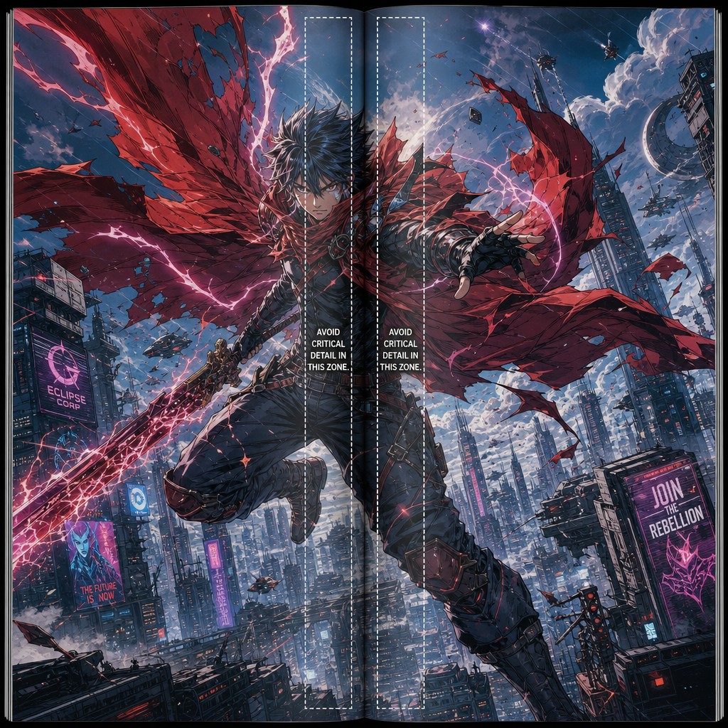
The gutter problem. A double-page spread has one gutter that matters more than any panel gutter on the page: the physical spine gutter where the two pages meet in the bound book. Any critical visual information (a character's face, important lettering, a focal point of the composition) placed too close to this central gutter risks being visually swallowed by the binding in print formats, or awkwardly split across a digital reader's page-turn in screen formats. Professional page designers keep the most essential visual information clear of roughly the inner 5-10% of each page's width, reserving that zone for compositional elements that can tolerate being partially obscured (background detail, secondary figures, environmental texture) rather than focal points.
Spreads are reserved, not routine. Because a spread effectively "spends" two pages' worth of the book's finite page count on a single image, and because it interrupts the normal page-turn rhythm the reader has been trained into, spreads carry outsized dramatic weight purely by being rare. A spread used for an ordinary beat reads as a production indulgence; a spread reserved for the single biggest visual moment in a chapter (the kind of beat the Scene Function Map would tag as a top-tier escalation or climax code) earns its real estate and lands with maximum force because the reader has not seen one in many pages. This compendium recommends treating spread frequency as a budget — roughly one true double-page spread per significant arc-level escalation, not one per issue as a matter of habit.
The page-turn reveal is a distinct technique from the spread itself. A closely related but mechanically different device is using the physical act of turning the page as a storytelling beat — ending the left-hand page on a question, a held breath, or a withheld reveal, so that the reader's own hand-motion of turning to the next page becomes part of the suspense mechanism. This works because in a standard bound or digital reading format, the reader can see the left-hand page while still being unable to see the right-hand page until they turn — meaning the right-hand page (not the spread) is structurally the better location for any reveal that wants to surprise the reader, since a spread is, by definition, seen all at once and therefore cannot "surprise" mid-read the way a page-turn can. Volume 3 will cover page-turn pacing in dedicated depth as part of its treatment of pacing and rhythm across sequences.
[AM-02.F06] — Instructional diagram of a double-page spread layout showing two facing comic book pages side by side as they would appear in an open physical book, with a visible central spine gutter rendered as a subtle vertical shadow line down the middle. A single enormous dynamic action composition spans across both pages showing an anime-style hero figure in a powerful full-body pose against a vast science-fiction city skyline backdrop, with a thin dashed annotation box highlighting the inner 10 percent margin on each side of the spine gutter labeled "AVOID CRITICAL DETAIL IN THIS ZONE," clean instructional diagram overlay on top of dynamic full-color dramatic comic book splash art, McFarlane-influenced dramatic inking and dynamic pose.
2.7 — Margins, Trim, and the Physical Page Edge
One final structural consideration belongs in this foundational volume on page architecture, because it is frequently invisible to readers but absolutely binding for anyone producing pages destined for actual print or fixed-format digital publication: the relationship between the drawn page, the trim edge (where the physical page is actually cut), and the bleed (extra artwork drawn beyond the trim edge specifically to accommodate printing tolerance).
Any panel intended to reach the literal edge of the page — the tachikiri technique referenced in Volume 1 — must be drawn extending slightly past where the final trim edge will fall, because commercial printing (and many digital export pipelines) cannot guarantee perfectly precise cutting or rendering at the absolute pixel edge. Artwork that stops exactly at the trim line risks a visible thin white sliver of un-inked paper at the page edge after trimming, which reads as a production error rather than a deliberate bleed effect. The conventional safety margin in commercial print comics production is approximately 0.125 inches (3mm) of extra bleed art beyond the trim edge on any side the art needs to reach.
Separately, a safe margin (sometimes called a "live area") is typically maintained around the opposite end — keeping essential panel content (faces, critical lettering, key action) a comparable distance inward from the trim edge, so that any minor variance in trimming or cropping during reproduction doesn't clip something the reader needs to see. For TAC, given the primary output is digital (web/app reading via SAGE's publishing pipeline) rather than physical print runs, the trim/bleed discipline matters less for literal cutting tolerance — but the safe margin discipline still matters enormously for responsive display, since different screen aspect ratios and viewer zoom levels can effectively crop a page's edges unpredictably on a phone or tablet screen in ways a fixed print page never would. This compendium recommends SAGE's export pipeline treat the safe margin discipline as load-bearing even though the bleed discipline is comparatively optional for an exclusively digital release.
2.8 — Closing Summary of Volume 2
This volume moved the compendium's focus from the individual panel (Volume 1) to the page as the true unit of composition. It established the tier system as the underlying structure beneath nearly all page layouts, including deliberately "broken" ones; the five compounding factors of visual weight (size, contrast, detail density, position, isolation) that determine where a reader's eye lands first; negative space as an actively designed element rather than incidental leftover; six named recurring layout patterns (Regular Grid, Pyramid, Anchor Panel, Mosaic Insert, Vertical Stack, Diagonal Cascade) that give a production team shared vocabulary for fast layout communication; the whole-page composition method of blocking value and weight before adding panel borders; the double-page spread as a structurally distinct category governed by spine-gutter discipline and reserved-frequency dramatic economy; and the print-production realities of trim, bleed, and safe margin that remain relevant even for a primarily digital publication pipeline like SAGE's.
Volume 3 builds on both prior volumes to address pacing, time, and rhythm across multiple pages — how panel-to-panel transition theory (Volume 1) and page-level composition (Volume 2) combine across a full sequence of pages to control reading speed, build tension toward a reveal, and use the page-turn itself as a deliberate storytelling device.
End of AM-02. Continue to AM-03: Pacing, Time & Rhythm Across Pages.
❦ FIN ❦