Anime Comic Production · 1 / 5
Anime Comic Production 01

ACADEMY MASTERCLASS — Compendium of Anime Comic Book Production
Volume 1: Foundations of Panel Grammar
Issue Reference Prefix: AM-01
Preface to the Compendium
This is the first volume of a multi-part Masterclass on the art and craft of producing anime-style comic books — the full sequential storytelling discipline that sits underneath every page of The Anima Chronicles once it moves from prose beat to drawn panel. The compendium draws from two traditions that are usually taught separately and rarely taught together:
The Japanese manga tradition — Tezuka's cinematic grammar, the Shonen Jump house style, the decompressed pacing of Naoki Urasawa, the architectural page-breaking of Inio Asano — where the page, not the panel, is the primary unit of composition, and reading direction (right-to-left, top-to-bottom) shapes every layout decision.
The American tradition — the Kirby/Ditko Silver Age grid, the Miller/Sienkiewicz expressionist break from the grid in the 1980s, and critically for your stated influences, the Todd McFarlane / Image Comics era of the early 1990s, where oversized, baroque panel borders, dynamic figure work bursting past panel edges, and a more painterly, decompressed sense of spectacle redefined what a "big moment" page looked like in Western comics.
TAC sits stylistically between these — an anime-influenced visual language (clean linework, expressive faces, dynamic speed-lines) married to a Western sense of page-as-event (splash pages, big two-page reveals, McFarlane-style panel-breaking for hero beats). This compendium will keep returning to that hybrid identity, because it is the actual production target, not an academic abstraction.
Each volume builds on the last. Volume 1 establishes the vocabulary and the underlying grammar of the panel itself — what it is, what its borders mean, how gutters function, and how reading paths differ between traditions. Later volumes build pages out of these atomic units, then sequences out of pages, then full chapters out of sequences.
1.1 — What a Panel Actually Is
A panel is not simply "a box with art in it." A panel is a unit of contained time and contained space, bounded by a border (explicit or implied), that asks the reader to treat everything inside it as a single moment of perception. The border is a contract: everything inside this line happened together, in this place, in this instant (or this held duration).
This sounds simple until you start breaking the rules — and the entire history of comics page design, from Tezuka to McFarlane, is a history of artists discovering what happens when you bend or break that contract on purpose.
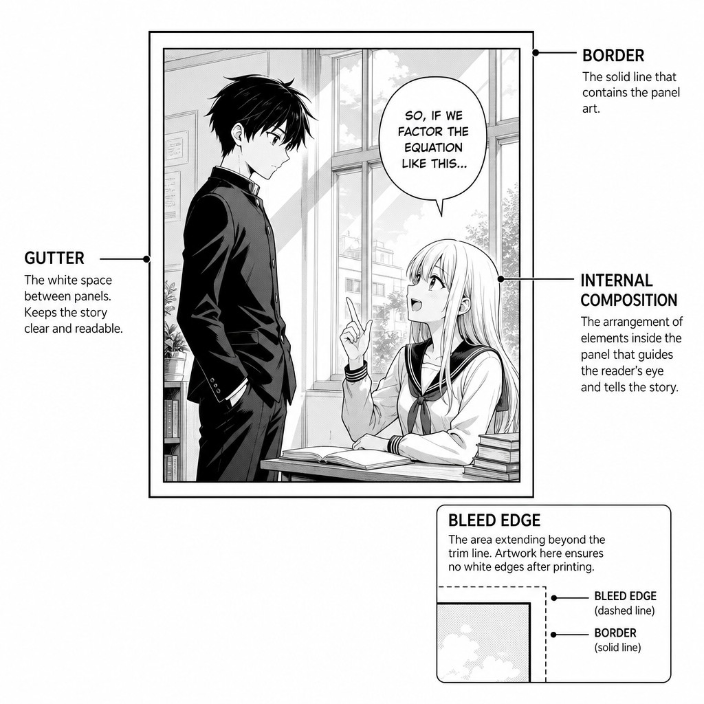
There are four components every panel negotiates, whether the artist thinks about them consciously or not:
1. The border — the line (or absence of line) that separates "in this moment" from "not in this moment." Borders can be thin ruled lines (clean, controlled, classical), thick brush-inked borders (aggressive, used heavily by McFarlane and Image-era artists for impact panels), jagged or broken borders (violence, instability, a mind under stress), or absent entirely (a "bleed" panel, floating in white or black space, often used for emotional isolation or a character removed from physical context).
2. The gutter — the space between panels. This is arguably the most important invisible element in all of sequential art. Scott McCloud's foundational analysis of comics theory identified the gutter as the site of closure — the reader's mind automatically fills in the action that happened between panel A and panel B. Nothing is drawn there. The reader draws it themselves, in their imagination, every time. This is, structurally, the exact mechanism by which comics differ from both prose (which has no spatial gap to fill) and film (which shows you every frame). A comic page is full of holes the reader's brain is unconsciously stitching shut, and a master page designer is, in large part, a master of deciding exactly how wide to make those holes.
3. The internal composition — everything McFarlane, Miller, or a manga-ka draws inside the border: camera angle, character blocking, depth of field, foreground/background relationship, motion lines, speed lines, impact frames (the manga convention of a near-abstract burst pattern behind a high-intensity story beat).
4. The panel's shape and size relative to its neighbors — this is where panel grammar stops being about any single panel and starts being about the page as a system. A panel's emotional weight is never absolute; it is always relative to the panels around it. A small panel surrounded by larger panels reads as a clipped, urgent beat. A panel that is disproportionately large compared to its neighbors reads as the dramatically privileged moment of that page — the moment the page wants your eye to land on and linger over.
[AM-01.F01] — Panel anatomy diagram: a single rectangular panel showing labeled callouts for border, gutter, internal composition, and bleed edge, manga-influenced linework style, instructional diagram aesthetic.
1.2 — Gutter Theory and the Mechanics of Closure
Because the gutter is invisible, it's tempting to treat it as "empty" — dead space. It is the opposite. The gutter is doing narrative work every time the reader's eye crosses it.
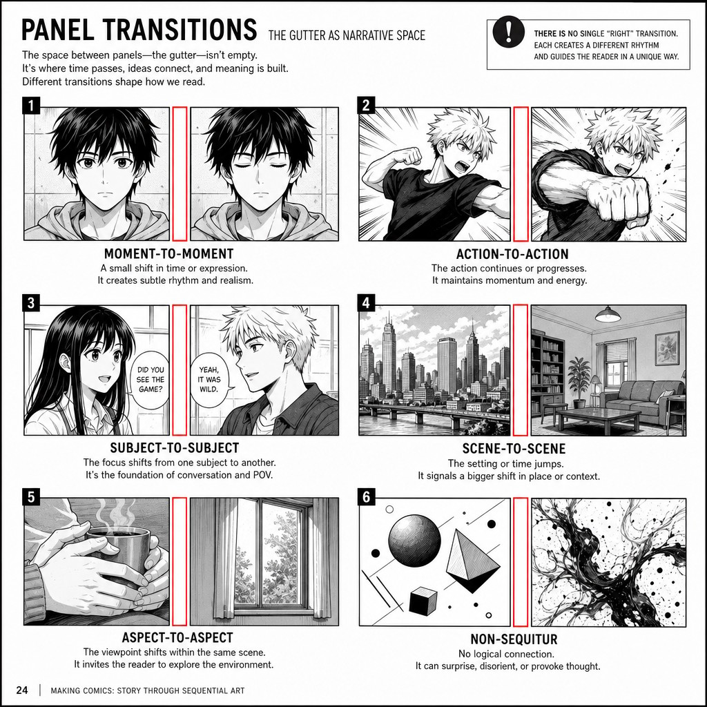
McCloud's taxonomy of panel-to-panel transitions remains the most useful lens for understanding what kind of work a given gutter is doing, and every page designer — manga or American — is implicitly choosing among these transition types whenever they break a scene into panels:
Moment-to-moment — almost no time passes across the gutter. A held breath. A blink. Manga uses this constantly for tension-building (a held glance before a confrontation); it is comparatively rare in mainstream American superhero comics, which tend to compress more time per panel.
Action-to-action — a single subject performs a continuous action, shown at two points in that action. This is the workhorse transition of nearly all action-comic storytelling, East and West.
Subject-to-subject — the panel changes who or what we're looking at, but stays within the same scene. Used for dialogue exchanges, group reactions, and the classic "reaction shot" beat.
Scene-to-scene — a significant jump in time and/or space. The reader does substantial inferential work here. Manga (especially decompressed, literary manga like Urasawa's) leans on this for slow, atmospheric pacing; American comics tend to mark these transitions more explicitly with caption boxes ("MEANWHILE...") though modern decompressed Western comics (Bendis-era Marvel, for instance) increasingly trust the silent scene-to-scene cut.
Aspect-to-aspect — a transition that abandons time almost entirely and instead wanders around different aspects of a single place, mood, or idea (a shot of hands, then eyes, then a window, then the whole room). This is heavily associated with Japanese manga and is comparatively rare in mainstream Western comics, where it can read as "decompressed" to the point of stalling momentum if overused. It is, however, an extremely powerful tool for establishing atmosphere — useful for TAC's quieter Tidalcross or Emberveil beats.
Non-sequitur — no logical relationship between panels at all. Rare, deliberately disorienting, used for dream logic, trauma, or altered states of consciousness.
The practical lesson for a working comic creator: the gutter width and panel-to-panel transition type should be a deliberate pacing choice, not an accident of layout convenience. A page of pure action-to-action panels reads fast. A page that suddenly drops into aspect-to-aspect panels slows the reader down hard — useful right before a reveal, disastrous if it happens accidentally in the middle of a fight scene.
[AM-01.F02] — Side-by-side instructional diagram showing six small numbered panel-pairs, each illustrating one of the six panel transition types (moment-to-moment, action-to-action, subject-to-subject, scene-to-scene, aspect-to-aspect, non-sequitur), clean educational comic-textbook style, black and white line art with red gutter highlighting.
1.3 — Reading Paths: East vs. West, and Why It Is Not Cosmetic
This is the single most consequential structural difference between manga and American comics, and it cannot be treated as a stylistic skin you apply after the fact — it changes how every panel on a page must be blocked internally.
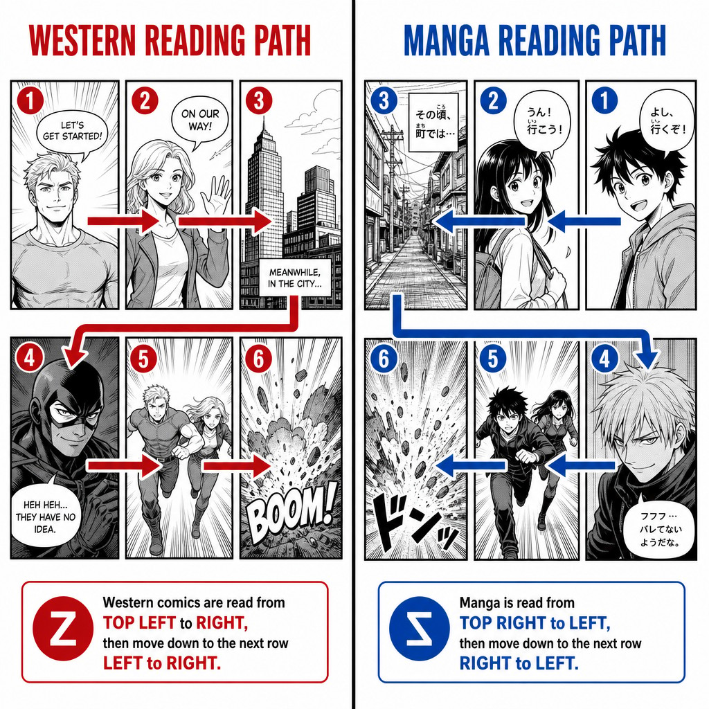
Western comics (Marvel, DC, Image/Spawn): read left-to-right, top-to-bottom, the same direction as Western prose. A character entering from the left of a panel reads as "arriving." A character exiting to the right reads as "leaving" or "advancing into the future" of the story. Action sequences are typically blocked so that the protagonist's forward momentum travels left-to-right across the page, because that matches the eye's natural Z-path movement.
Manga (and TAC, if produced in a manga-influenced format): read right-to-left, top-to-bottom. This is not merely "the same thing flipped" — it inverts the entire visual grammar of motion and emphasis. In manga, a character entering from the right of a panel reads as arriving; exits to the left read as departure or progress. Critically, the first thing the reader's eye encounters on a manga page is the top-right panel, and the last thing is the bottom-left panel — meaning the bottom-left position on a manga page carries the same "this is the conclusion of the page" weight that the bottom-right position carries on a Western page.
This has a direct, practical consequence for TAC: the reading-path decision must be made before a single panel is composed, because reversing it later is not a simple horizontal flip — flipping the whole page also flips every character's profile, every readable sign or text element in-world, every gun a character is holding in their dominant hand, and any asymmetrical worldbuilding detail (a civilization's insignia, a scar, a cybernetic limb side). Studios that get caught having to "flip" pages late in production (this happened historically to manga being adapted for early Western markets, before publishers switched to preserving native right-to-left format) end up with continuity errors across the whole book.
The Z-path vs. the N-path: Western comics generally follow a "Z" reading path across a tier of panels (left to right, then drop down and repeat). Manga, in right-to-left format, follows a mirrored "Z" that is sometimes described as an "N" shape when you trace it visually starting from the top-right: across to the left, drop down, across to the left again.
[AM-01.F03] — Two-panel comparison diagram: left side shows a Western comic page grid with numbered red arrows tracing a Z-shaped left-to-right top-to-bottom reading path; right side shows an equivalent manga page grid with numbered blue arrows tracing the mirrored right-to-left reading path starting top-right, clean instructional diagram style with panel numbers 1 through 6 marked on both grids.
The practical recommendation for SAGE/TAC: Because TAC is intended for a Western-literate primary audience but draws deeply on anime visual language, the compendium recommends defaulting to Western left-to-right reading order for the primary publication format, while consciously borrowing manga's internal panel grammar (decompression, aspect-to-aspect atmosphere panels, dynamic diagonal panel breaks) rather than its reading direction. This gives you anime's storytelling DNA without forcing a reading-direction choice that will fight against an audience's ingrained left-to-right habits. (If a deliberate "manga-format" spinoff or homage issue is ever produced, that is the moment to flip the whole pipeline — but it should be a one-time, whole-issue decision, never a per-page one.)
1.4 — The Panel Grid: Origins and the Case for Breaking It
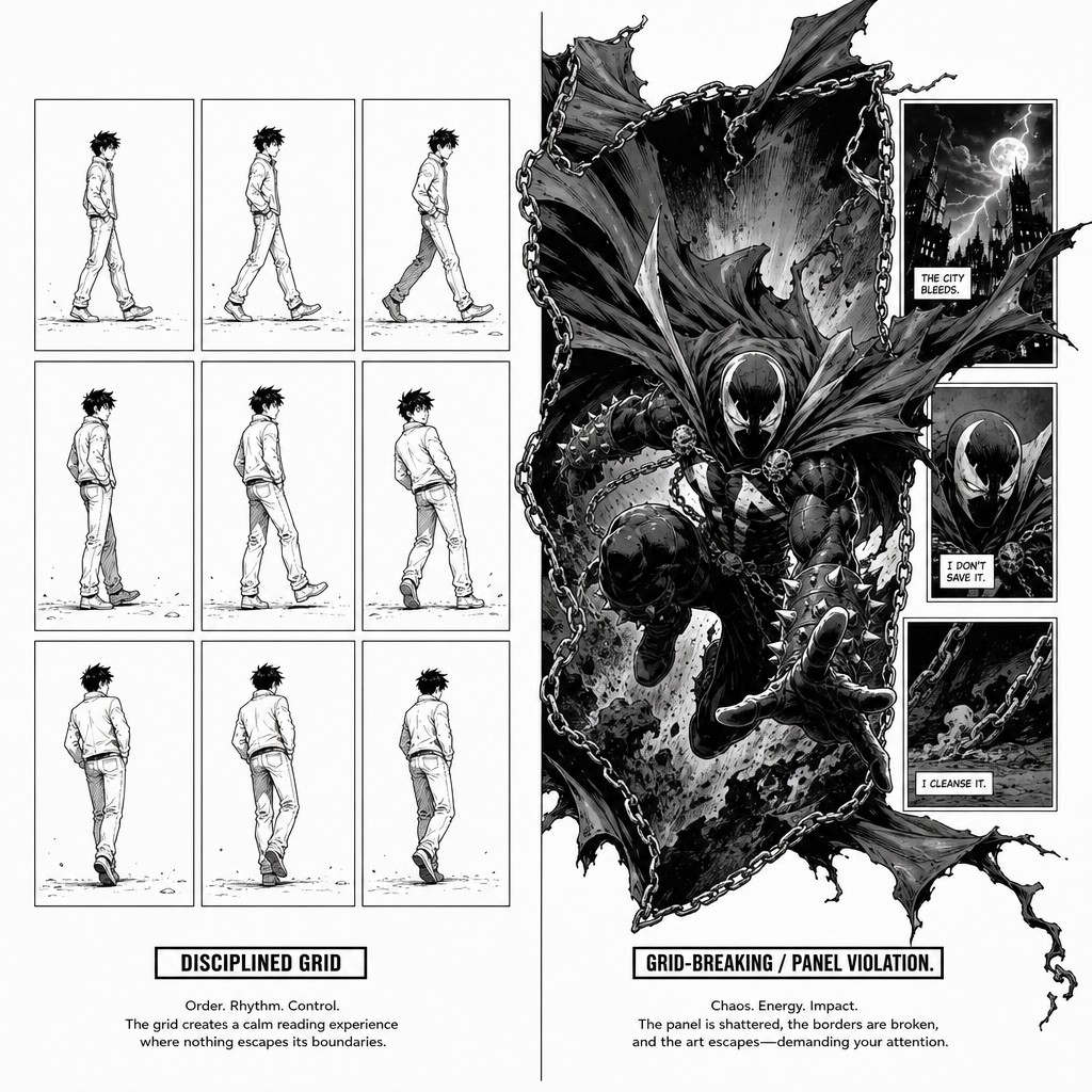
Almost every major comics tradition starts from some version of a regular grid — most famously the nine-panel grid (3x3), which became something close to a default unit in mid-20th-century American comics (Kirby used it constantly; Alan Moore and Dave Gibbons later made it the entire structural spine of Watchmen, using its rigid regularity as a thematic device — order, surveillance, clockwork fate).
The nine-panel grid (or its cousins: the six-panel 2x3 grid, the four-panel 2x2 grid) persists because it solves real production problems:
Predictable pacing — each panel reads as roughly one "beat" of comparable weight, which makes equal-weighted dialogue scenes, procedural sequences, and methodical builds easy to script and easy to read.
Print economy — historically, regular grids were faster to letter, faster to color, and more forgiving of ad placement and trim variance in mass commercial printing.
A baseline against which to break — and this is the part most relevant to your McFarlane interest. A strict grid is only dramatically powerful because the reader's eye has been trained, page after page, to expect it. The grid's true narrative function is to set up the expectation that gets violated for the big moment.
Todd McFarlane and the Image Comics generation (1990s) made grid-breaking itself a signature. Where Silver Age Marvel/DC mostly stayed inside a disciplined grid with the occasional "hero shot" splash, McFarlane's Spawn treated the panel border itself as a piece of art — borders made of writhing chains, smoke, organic tendrils, or jagged broken glass; figures (especially Spawn's cape) routinely bursting past the panel border into the gutter or even into a neighboring panel's space; entire pages built around one dominant irregular shape with smaller panels crammed into the negative space around it, rather than a tidy stacked-tier grid. This is sometimes called "panel violation" in craft analysis: a figure or effect that physically crosses a border it is supposed to be contained by, which reads viscerally as that figure's power or intensity literally exceeding the page's ability to contain it.
[AM-01.F04] — Comparison study: left panel shows a clean disciplined 3x3 nine-panel grid page with simple sequential action, right panel shows a McFarlane Spawn-style grid-breaking hero page where one large irregular panel with a jagged organic border dominates the composition and a cloaked figure's cape physically bursts past the panel border into the gutter space, dramatic chiaroscuro inking, dynamic comic book art style, instructional side-by-side comparison layout.
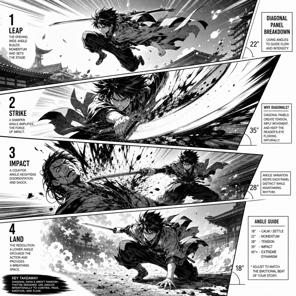
Manga's relationship to grid-breaking is different in flavor but converges on a similar idea. Where McFarlane breaks the grid through ornate, painterly border violation, manga (particularly shonen action manga — think the visual language of Naruto, Jujutsu Kaisen, Demon Slayer) tends to break the grid through diagonal panel slashes — panel borders cut at sharp angles rather than orthogonal rectangles, used to inject kinetic energy into an otherwise static-feeling tier, and through panels that bleed off the trim edge of the page entirely (called "tachikiri" in Japanese production terminology) to suggest a scene or a feeling too large for the page to hold.
[AM-01.F05] — Manga-style diagonal panel break diagram: an action sequence shown across four panels where panel borders are cut at sharp dynamic angles rather than right angles, speed lines crossing the gutters, kinetic shonen battle manga art style, clean black and white linework, instructional diagram with angle measurements annotated.
The governing principle for TAC: establish a baseline grid logic for ordinary narrative beats (dialogue, procedural movement, worldbuilding exposition across the seven civilizations) so the reader's eye is calibrated to "normal," and reserve grid violation — McFarlane-style border-bursting or manga-style diagonal slashing — specifically for the beats the Scene Function Map tags as high dramatic-function intensity: Anima Principle awakenings, Crown Heist action beats, Noctura's transformation phases, and other top-tier spectacle moments. If every page breaks the grid, none of them do.

1.5 — Panel Shape as Emotional Vocabulary
Beyond size and border style, the aspect ratio of a panel carries its own connotation, consistently enough across both traditions that it functions as a kind of shared visual vocabulary:
Wide, short panels (letterbox / cinematic ratio) — read as expansive, landscape-oriented, often used for establishing shots, vistas, or a "camera pulling back." Strongly associated with widescreen decompressed storytelling (Bryan Hitch–style "widescreen comics" in American work; many of Urasawa's establishing panels in manga).
Tall, narrow panels — read as vertical, claustrophobic, or emphasizing height/scale (a tower, a falling body, a standing confrontation). Manga uses extremely tall narrow panels often, partly because the right-to-left vertical reading habit accommodates them naturally.
Square or near-square panels — neutral, "default" weight; the workhorse shape for routine dialogue and procedural beats.
Irregular / non-rectangular panels (circles, diagonals, organic shapes) — inherently call attention to themselves as constructed objects, breaking the reader's sense that they are looking through a "neutral window." Used sparingly for stylization, fantasy/dream sequences, or — as discussed above — power-level spectacle.
A panel's shape should never be chosen arbitrarily or purely to "fit the available space" on a page (a common production-pressure mistake). Each shape choice is doing emotional work, and an experienced page designer chooses panel shape before finalizing internal composition, because the shape constrains and informs how the action inside it should be blocked.
1.6 — Borders as Narrative Mode-Switches
One more grammar element belongs in this foundational volume because it will recur constantly in later volumes on pacing and lettering: border style itself is a signal of narrative mode, independent of the art inside it. A reader trained on either tradition unconsciously reads:
Solid thin black border — default, "real time," objective narration.
Wavy / scalloped border — flashback, memory, or a told story (a convention shared by both manga and American comics, though manga sometimes substitutes a grey-tone or halftone background fill instead of a wavy border to signal the same thing).
Jagged, lightning-bolt, or torn border — psychic intrusion, vision, prophecy, or trauma flashback with violent emotional charge. Extremely useful for TAC's Anima Principle visions and Noctura's nine-phase transformation sequence.
No border / panel bleeds to page edge — the "tachikiri" technique mentioned above; used for moments the story wants to feel unbounded by ordinary panel logic — often hero entrances, emotional climaxes, or scope-establishing vistas.
Border made of an in-world material (smoke, water, circuitry, organic tendrils — McFarlane's signature device) — ties the panel's frame itself to the story's diegetic content, blurring the line between "the window we're looking through" and "the world we're looking at." This is a powerful, slightly unusual technique worth reserving for TAC's civilization-specific stylistic signatures — for example, Tidalcross panels using a water-ripple border motif for that civilization's underwater sequences, or Drift Coalition panels using a fraying-rope/cable border motif consistent with their aesthetic.
[AM-01.F06] — Border style reference sheet: six small rectangular panel examples arranged in a grid, each demonstrating a different border treatment — solid thin black line, wavy scalloped flashback border, jagged lightning-bolt psychic border, borderless bleed edge, organic smoke-tendril border, and water-ripple border — clean instructional comic art textbook diagram with small labels beneath each example.
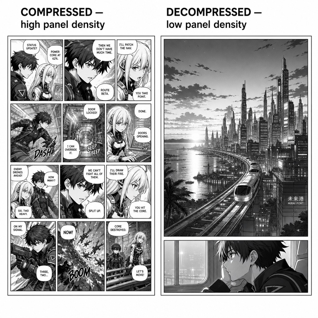
1.7 — Panel Density and the "Beat Economy" of a Page
Before moving to full-page composition in Volume 2, it is worth establishing one more foundational concept that governs every decision in the volumes that follow: panel density — how many panels a single page contains — is not a layout afterthought, it is a direct expression of pacing philosophy, and the manga and American traditions have historically diverged on this more than almost any other single metric.
Decompression vs. compression is the standard craft term for this axis. A compressed page (more panels, smaller panels, more incident per page) moves the reader through more plot in less reading time. A decompressed page (fewer panels, larger panels, sometimes a single page per single beat) slows the reader down and asks them to sit inside one moment longer.
Classic Silver Age American comics (Kirby-era Marvel) were comparatively compressed by modern standards — six to nine panels per page was common, dialogue-dense, plot moved fast because page count itself was expensive and stories had to resolve in 22 pages. The decompression movement that began in earnest in the late 1990s and 2000s (Bendis's Ultimate Spider-Man, Hitch's The Authority, much of the modern Image Comics catalogue including later McFarlane-adjacent work) deliberately slowed this down — sometimes spending an entire page on a single two-panel beat, trusting the larger panel size and surrounding white space to carry emotional weight that a denser page would dilute.
Manga's relationship to decompression is, in many ways, the origin point Western comics were reacting to. Osamu Tezuka's postwar innovation — explicitly modeling manga page rhythm on film editing — normalized panel counts and panel-size variance that would have seemed wildly indulgent by 1950s American standards: a single page might contain only two or three panels, one of which is a huge "establishing" panel of a landscape with no dialogue at all, purely to let the reader breathe before or after an intense sequence. This rhythm — intense compressed action sequence, then a page or two of near-silent decompressed breathing room, repeat — is one of the most recognizable structural fingerprints of long-running shonen and seinen manga, and it is largely why manga reads so much faster per-page than its panel count would suggest: low-density pages cost almost no reading time, so a 200-page manga chapter can be consumed in roughly the time it takes to read a 22-page American single issue, despite having nearly ten times the page count.
The practical "beat economy" rule: every panel on a page is spending a finite resource — the reader's attention and the page's physical space — and a working page designer should be able to articulate, for every panel, what beat is this panel buying, and is it worth the space it costs? A six-panel page of pure exposition dialogue is using its panel budget efficiently if the scene genuinely needs six distinct beats of information or reaction. The same six-panel grid wrapped around a single sentence of dialogue and a static reaction shot is wasting page real estate that could have been a tighter three-panel page — or, alternately, could have been "spent" instead on a single, larger, more atmospheric two-panel page that gives the same beat more emotional room to land.
This matters enormously for a project at TAC's scale. With 500+ confirmed beats tagged across six seasons in the Scene Function Map, panel-density decisions made consistently (rather than page-by-page improvisation) are what will make sixty episodes' worth of comic adaptation feel like one coherent visual language rather than sixty different artists' worth of inconsistent pacing. A useful production heuristic: dramatic-function codes that map to "escalation" or "climax" beats should default toward decompression (larger panels, lower density, more white space); codes that map to "procedural" or "transit" beats should default toward compression (smaller panels, higher density, faster reading speed). This single rule, applied consistently, does most of the work of making a page feel correctly paced before a single line is drawn.
[AM-01.F07] — Two side-by-side manga-influenced pages demonstrating beat economy: left page shows a dense nine-panel compressed sequence of rapid dialogue and procedural action with small uniform panels, right page shows a decompressed two-panel page with one enormous atmospheric establishing panel of a futuristic coastal city skyline at dusk and one small panel beneath showing a single quiet character close-up, instructional side-by-side comparison, clean black and white manga-style linework with annotated labels reading "COMPRESSED — high panel density" and "DECOMPRESSED — low panel density."
It is worth noting one more McFarlane-specific contribution to this conversation, since it sits slightly outside the simple compression/decompression binary: Spawn-era Image Comics popularized pages that are technically high-detail and visually dense (elaborate inking, heavy texture, ornate borders) while still being structurally decompressed (few panels, often just one to three per page). This combination — low panel count paired with extremely high per-panel rendering density — produces a distinct reading sensation from manga's low-panel-count pages, which tend toward comparatively sparse, clean linework even when decompressed. The lesson for TAC's hybrid house style: decompression (how many panels) and rendering density (how much detail and texture within each panel) are two separate dials, not one, and the most McFarlane-influenced pages will want to push both — fewer panels, but each one heavily rendered — while TAC's quieter manga-influenced atmosphere pages may want low panel count paired with comparatively spare, breathing linework instead.
1.8 — Closing Summary of Volume 1
This volume established the irreducible units of panel grammar: the border as a contract about contained time and space; the gutter as the active site of reader-performed closure, governed by McCloud's six transition types; the consequential, non-cosmetic difference between Western left-to-right and manga right-to-left reading paths; the nine-panel grid as both a production default and a baseline to be deliberately violated (McFarlane-style border-bursting, manga-style diagonal slashing); panel shape as emotional vocabulary; border style itself as a narrative mode-switch independent of the art it contains; and panel density as the "beat economy" that governs compression versus decompression across a page.
Volume 2 builds directly on this foundation to address the next level up: the page as a single compositional unit — how individual panels are arranged into tiers, how tiers combine into a full page, how the eye is guided across a complete page using weight, size, and negative space, and how double-page spreads function as their own distinct compositional category entirely separate from single-page layout.
End of AM-01. Continue to AM-02: Page Composition & Layout Architecture.
❦ FIN ❦